Dreamed this up last night, more to follow....
..lots more...
Subject to change*
I'll buy that! (EVERYday - heh!)
Ponce De Leon looked for it too and you see where that got him.
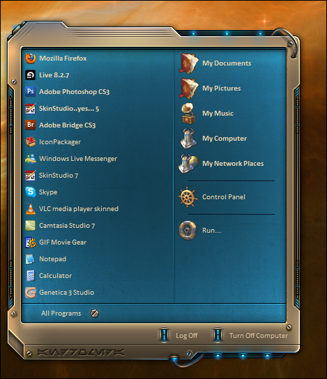
Just compared the screenshot with the previously posted PSD both looking good but now the fine cuttings on the metal stand more out giving it a more crispy look...PS i want that nebula background + My wife agrees i have to buy the skin when its done ... oh yeah thumbsup from her aswell
Interesting question.
I've always tried to be a little creative when it comes to lighting a visual style, If you take anything, in the real world, you can see light hitting it from different directions, objects that stick further out, further in, different materials, and colors, some things absorb light, some reflect, some diffuse.
Typically if i make a more minimal, usable skin, I will light from top left, and keep it uniform thru out the skin, shadows bottom right, etc. Global lighting.
When i make a more out of the box skin, like this, or Penthouse, Krome etc.. I like to throw light sources in from different angles, different strengths, different colors and shades.
Whether it is physically correct or not, to me, doesn't really matter..as long as to the eye..it looks good, and if It doesn't, someone is always gonna let me know.
Now, if I were doing still life drawings, or nature paintings, It would be different but I think in UI design you have a certain amount of creative license to break the rules a little in the interest of coming up with something eye catching for the end user.
As far as method, my two main weapons are a good vivid light blend mode in Photoshop, and my trusty dodge and burn brushes.
I make almost everything with vector shapes, then if I am going to do any brushing, flatten the image and go to town with the brushes.
Whether any of this made sense or not, I have no idea.. hope it helped.
Rolo.. I'll try find a link to those walls, they aren't mine but fit the skin exquisitely.
Cheers!
I learned something just now. Go figure.
Latest screenies looking real goooooooooooooooood John!
EDIT: fixed
Fixed...
Thanks for the insight. I especially appreciate how the lighting gives it a very definite sense of environment and atmostphere, a sense of place. To me, great skins and themes are all about immersion. Your approach to Andromeda, Penthouse, et al exemplifies this. I'm not great with graphics, so I learn a lot from quietly watching WIP threads like this and others, little things like adding a hint of blue to an otherwise flat gray and how much of a difference things like that make.
Anyhow, carry on.
Oh yes, throwing about 10% blue to an otherwise 'browny' grey is a must for me anytime I do anything grey\dark.
Thanks for your input, and if you ever need any help, I'm always around (unless I take a 3 month break)
Lurk on!
Still willing to do some dockage John. No rush, but could I have a current PSD to work off of?
Yes, you may, and you get double points for ... Off..of.
stand by.
(The unfortunate side to working off a PSD that has the main layer flattened and brushed is.. you have to work off a PSD that has the main layer flattened and brushed)
Here you go.. http://www.sendspace.com/file/zozny3 The included WB is XP only, half ass finished..
WB Updated for everyone else too. (includes scrollbars)
Don't click the wrong link.
Oops!
This WB looks stunning! And that's that I'm running the XP version on 7!
(Do I also get dougle points for "that's that"?)
Nope.. one point deduction for.. 'Dougle"